Project Brief
In a landscape where trends constantly shift, staying relevant is pivotal. Mjay’s aims to resonate with a fresh audience, seeking a redesign to invigorate growth amidst this dynamic market. This evolution reflects Mjay’s new aspirations, products, offers, and values, signaling a transformative journey.
Central to rebranding is the essence of contemporaneity. Design trends profoundly shape how Mjay’s is perceived by potential and current customers, showcasing its evolving offerings.
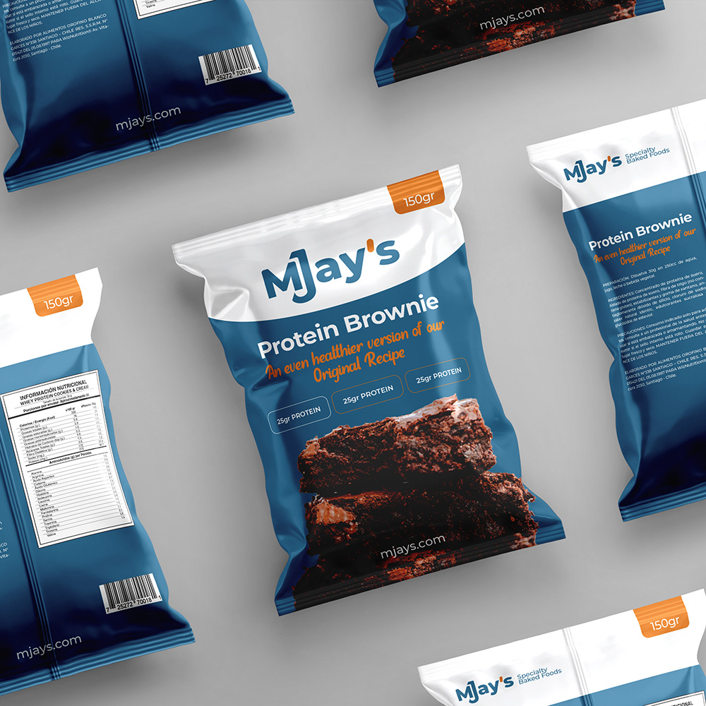
A pivotal aspect of Mjay’s rebranding initiative involves a shift in photography style, highlighting product details over packaging, placing images at the forefront of the new site.
While ushering in visual changes, elements from the current logo are retained, such as:
- Typography: Bold type, crafted for legibility and adaptability across product labels and corporate use.
- Horizontal Composition: A clean, modern layout ensuring versatile application.
- Character Spacing: Reduced to enhance visual impact and brand consistency.
Visual Identity Elements:
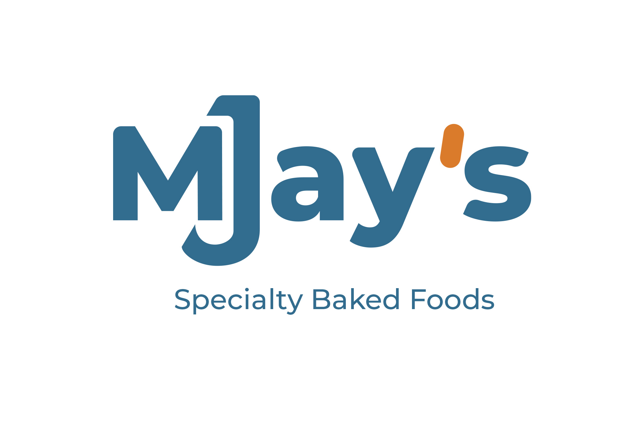
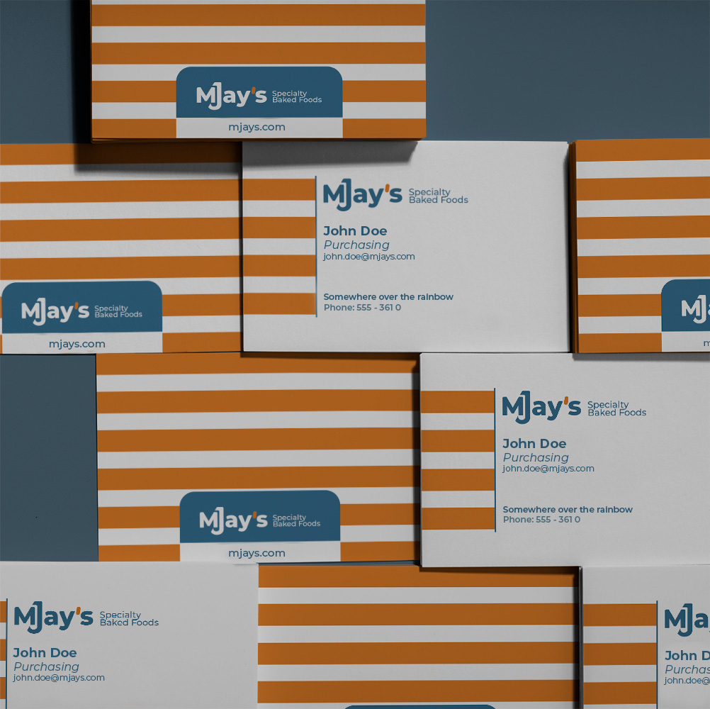
1. Corporate Logo Signage: The cornerstone, focusing on the legibility and adaptability of “MJays” across various applications, from stationery to web logos and factory signage.
2. Specialty Baked Foods: This variation emphasizes readability and aims to engage new customers, aligning the company’s name with its activity.
Logo Light Versions:
1. Primary Logotype: The core of the branding, ensuring a consistent and recognizable visual identity across diverse platforms.
2. Company Name Presentation: Tailored to appeal to new customers, showcasing the company’s identity aligned with its offerings.
Conclusion:
Mjay’s embarks on a rebranding journey poised to invigorate its presence in a changing market. By striking a balance between modernity and brand legacy, this endeavor aims to forge deeper connections and relevance in the hearts of both existing and prospective customers.
This refined overview seeks to encapsulate the essence of Mjay’s rebranding intentions, focusing on key visual elements and their strategic implications for the company’s evolution.
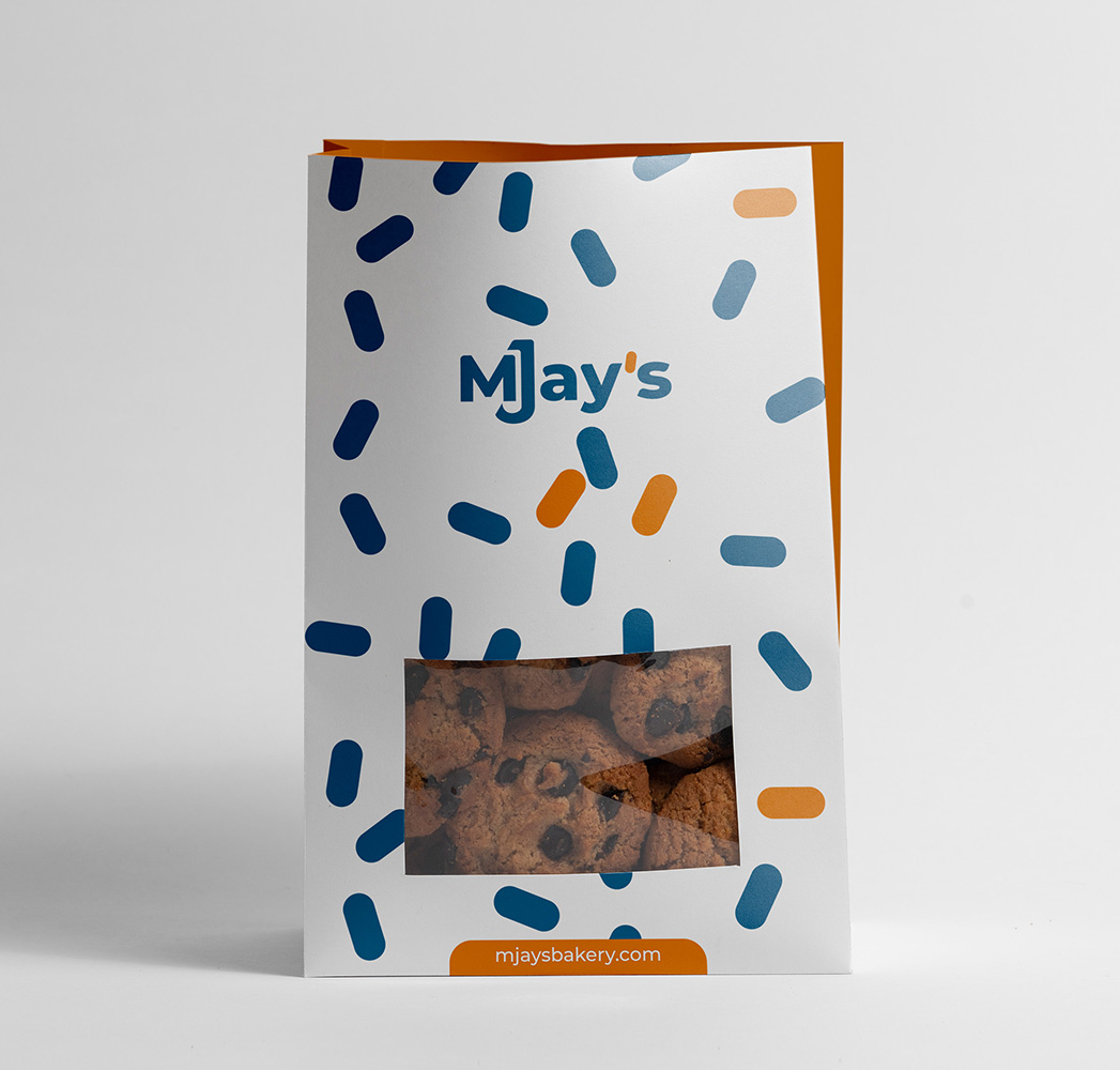
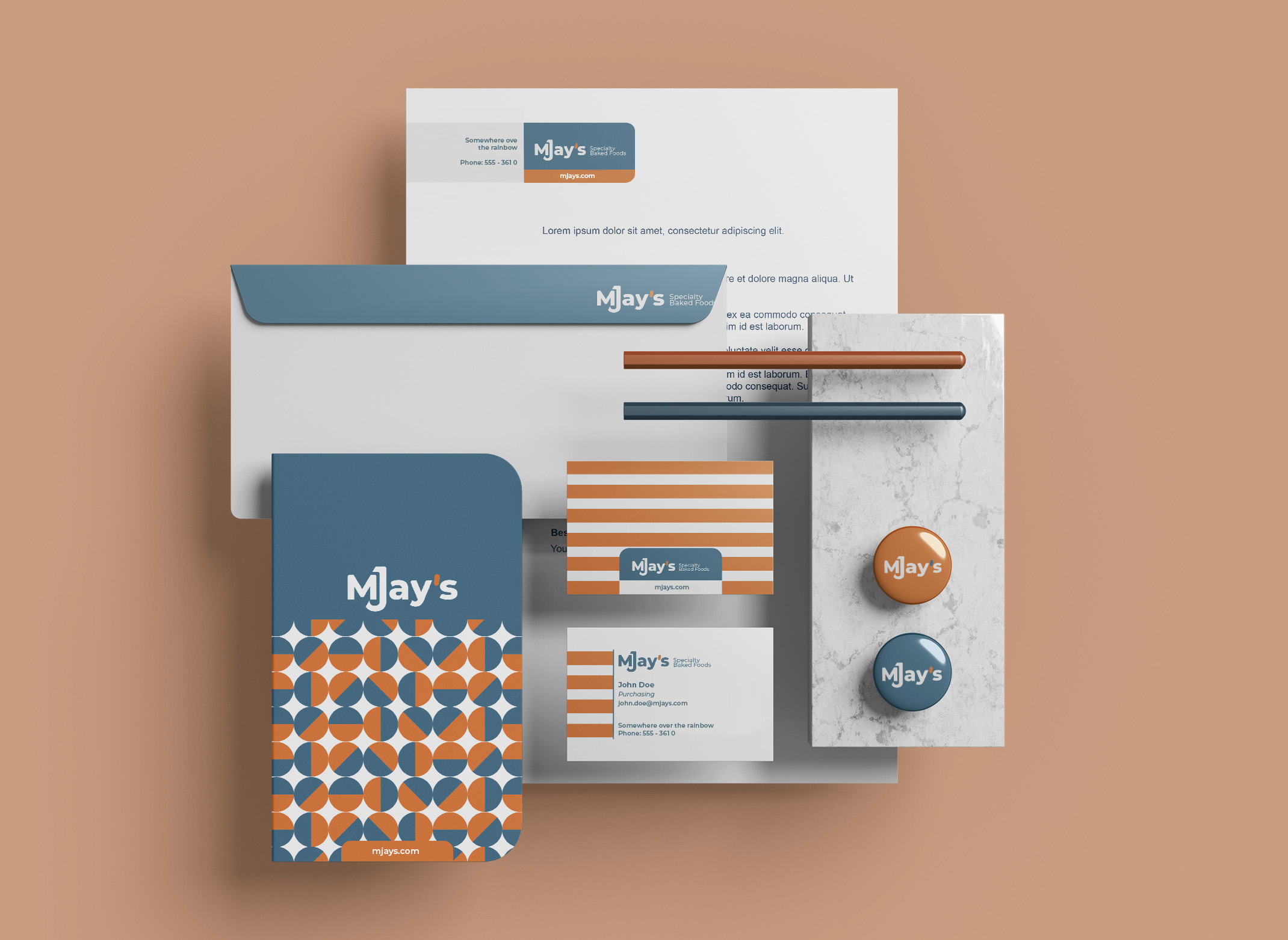
Conceptual Design Samples
Skills Needed
Cras volutpat, ipsum a dignissim pulvinar, turpis nulla egestas turpis, sit amet cursus diam nunc a neque. Maecenas ultrices molestie accumsan. Vivamus pretium vulputate massa, in venenatis mauris elementum eget. Class aptent taciti sociosqu ad litora torquent per conubia nostra, per inceptos himenaeos. Donec sagittis vestibulum turpis sit amet fermentum. Nam aliquet non magna ultricies interdum.
