Project Brief
WizNutrition, as a brand, embodies a commitment to health, wellness, and vitality. Its branding design is a reflection of these values, aiming to resonate with health-conscious consumers and position itself as a trusted provider of nutritional products.
The branding design of WizNutrition emphasizes:
- Clarity and Simplicity: The brand uses clean and straightforward design elements to communicate its message effectively. This simplicity helps customers easily identify and connect with the brand’s offerings.
- Vibrant and Fresh Imagery: Incorporating imagery that reflects energy, vitality, and health, WizNutrition’s design utilizes vibrant colors, natural elements, and fresh imagery to convey a sense of well-being and positivity.
- Trust and Credibility: The branding employs professional and authoritative design elements, fostering a sense of trust and reliability among its audience. Clear labeling, certifications, and endorsements contribute to this credibility.
- Consistency across Platforms: Whether it’s the logo, packaging, website, or social media, WizNutrition maintains consistency in its design language, ensuring that its brand identity is recognizable and cohesive across all touchpoints.
- Customer-Centric Approach: The design focuses on addressing the needs and desires of its target audience, aligning its visual elements with what resonates most with health-conscious consumers.
Overall, WizNutrition’s branding design aims to evoke emotions of trust, well-being, and a healthy lifestyle, creating a strong connection with its audience in the competitive health and wellness market.
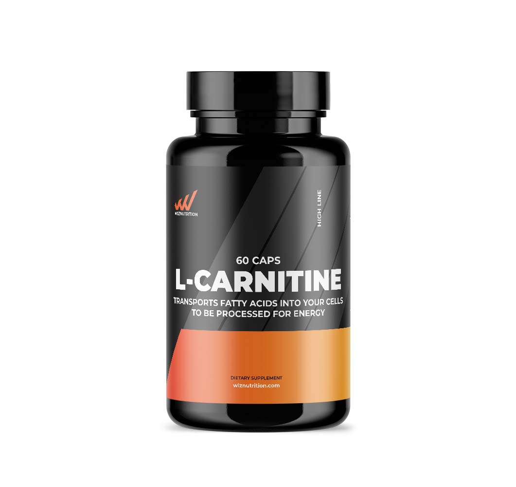
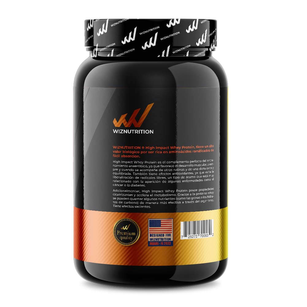
Highline
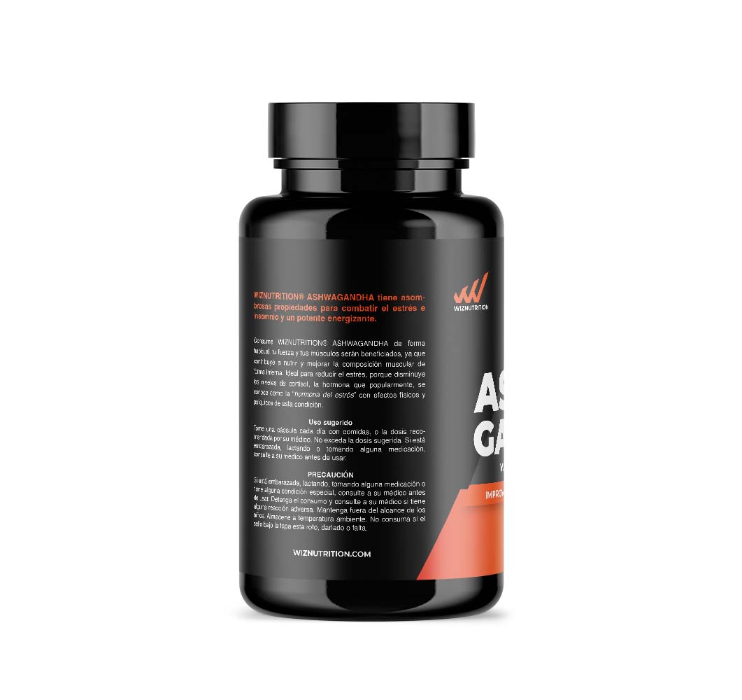
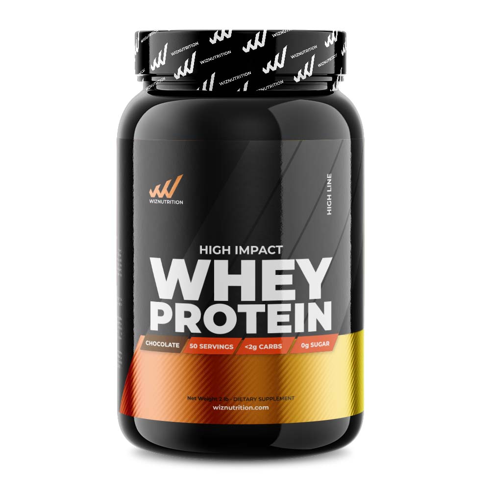
The Highline of WizNutrition represents a premium line of products within the brand’s range.
Its design is characterized by several key elements:
- Sleek and Premium Aesthetics: The design exudes sophistication and luxury, leveraging sleek and modern aesthetics. This could be reflected in the choice of packaging materials, such as high-quality finishes, embossing, or minimalist yet elegant design elements.
- Exclusive Packaging: The Highline packaging might feature unique and exclusive packaging designs, possibly using minimalist yet impactful labeling, premium color palettes, and possibly metallic accents to convey a sense of luxury.
- Detailed Information: While maintaining an elegant appearance, the packaging may include detailed information about the product’s high-quality ingredients, benefits, and the science behind the formulations. This could be presented in an informative and visually appealing manner, maintaining a balance between luxury and substance.
- Consistency with Branding: Despite its exclusive nature, the Highline design will likely maintain consistency with the overall branding of WizNutrition, ensuring that the premium line is recognizable as part of the broader brand while still showcasing its exclusivity.
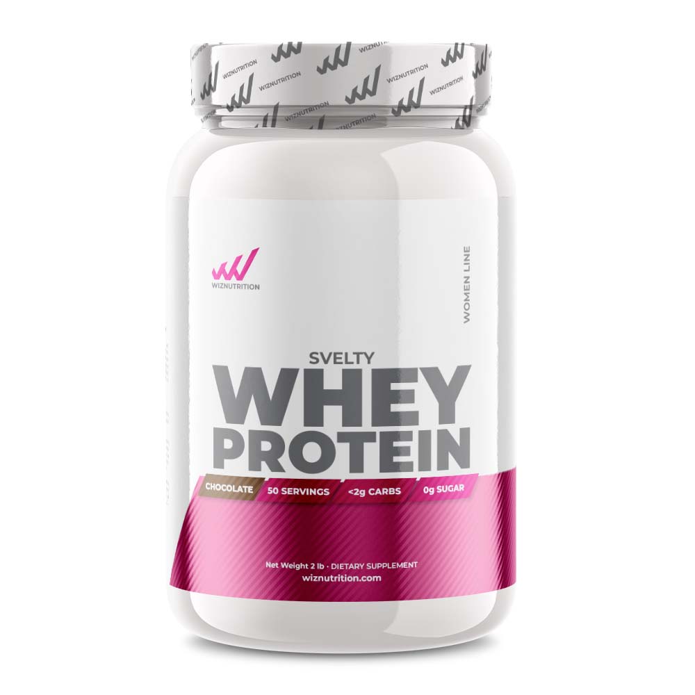
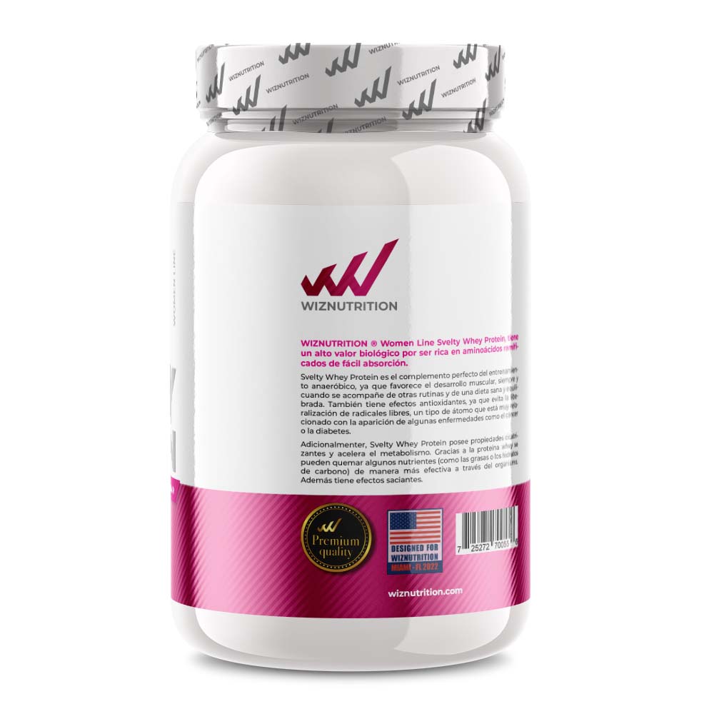
Women’s Line
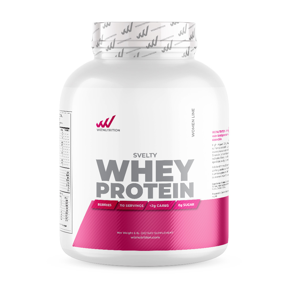
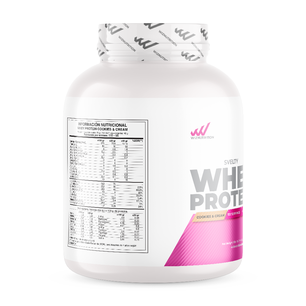
The Women’s Line within WizNutrition, being a specialized product range tailored for women’s health and wellness, would likely embody several distinct design elements:
- Feminine Aesthetics: The design would feature elements that cater specifically to the female demographic, employing softer color palettes, elegant typography, and possibly floral or nature-inspired motifs to resonate with women’s sensibilities.
- Empowering Imagery: Visuals and graphics might focus on themes of empowerment, health, and vitality. Imagery could showcase active and confident women, highlighting the benefits of the products in promoting wellness and strength.
- Clear Messaging: The packaging and branding would provide clear and concise information about the benefits and targeted aspects of women’s health that the products aim to support. This might include details about specific nutrients tailored for women’s needs, such as prenatal vitamins, hormonal balance, or skin and hair health.
- Supportive Content: The design could include informative content, potentially featuring wellness tips, guides, or inspirational quotes related to women’s health and lifestyle. This adds value beyond the product itself and establishes a deeper connection with the audience.
- Consistency with WizNutrition Branding: While tailored for women, the Women’s Line would maintain alignment with the broader WizNutrition brand, ensuring consistency in branding elements like logos, color schemes, and typography to maintain brand recognition and credibility.
Overall, the Women’s Line design for WizNutrition aims to create a visual identity that resonates with its target audience by offering a balance between aesthetics, informative content, and a strong emphasis on supporting women’s health and wellness goals.
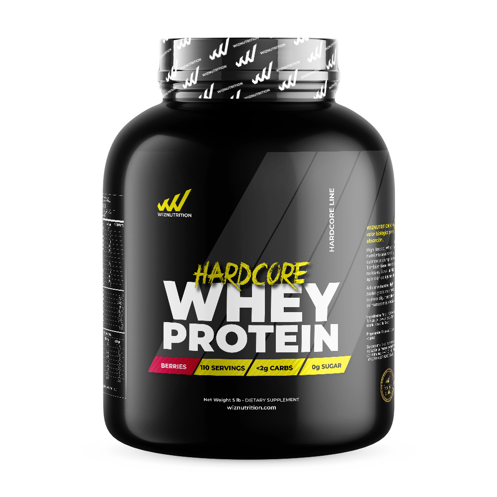
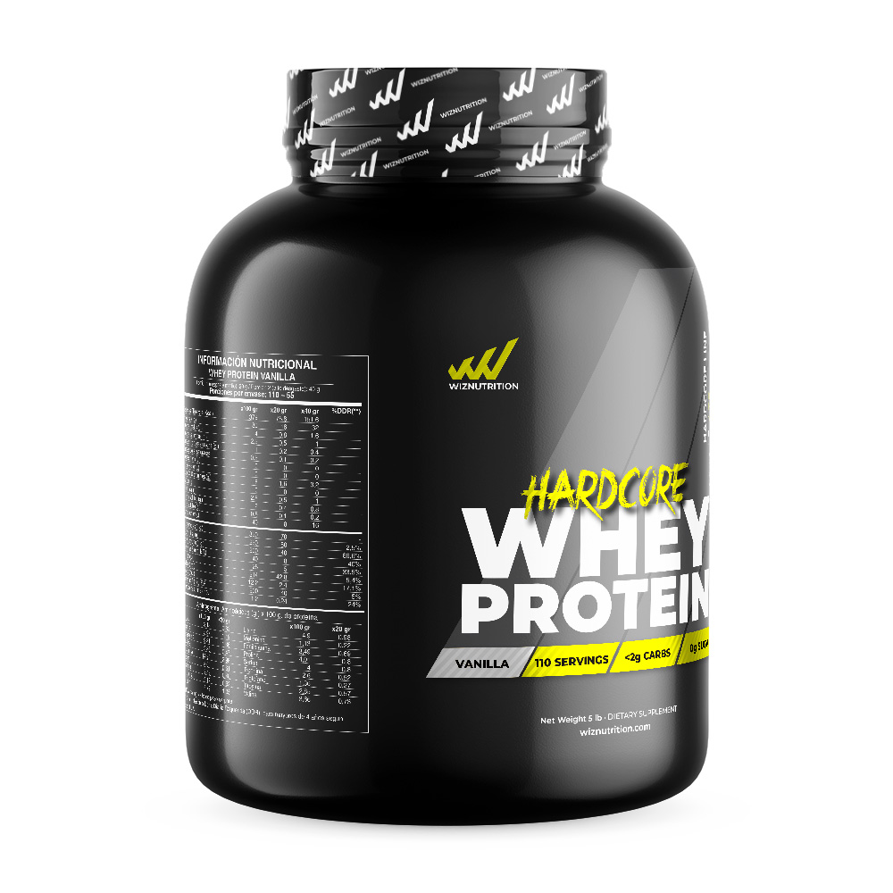
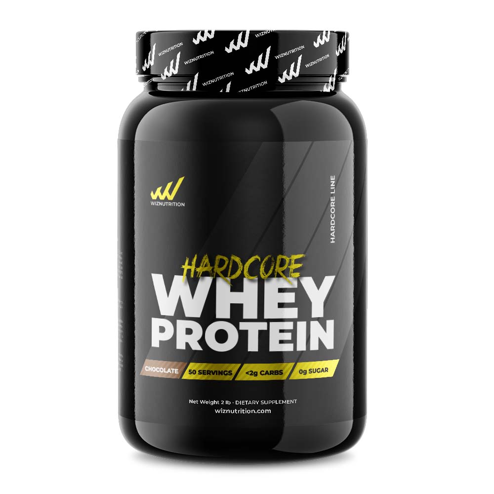
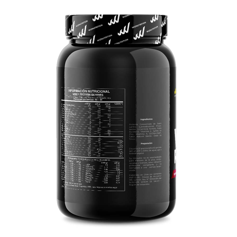
Hadcore Line
Promotional Elements
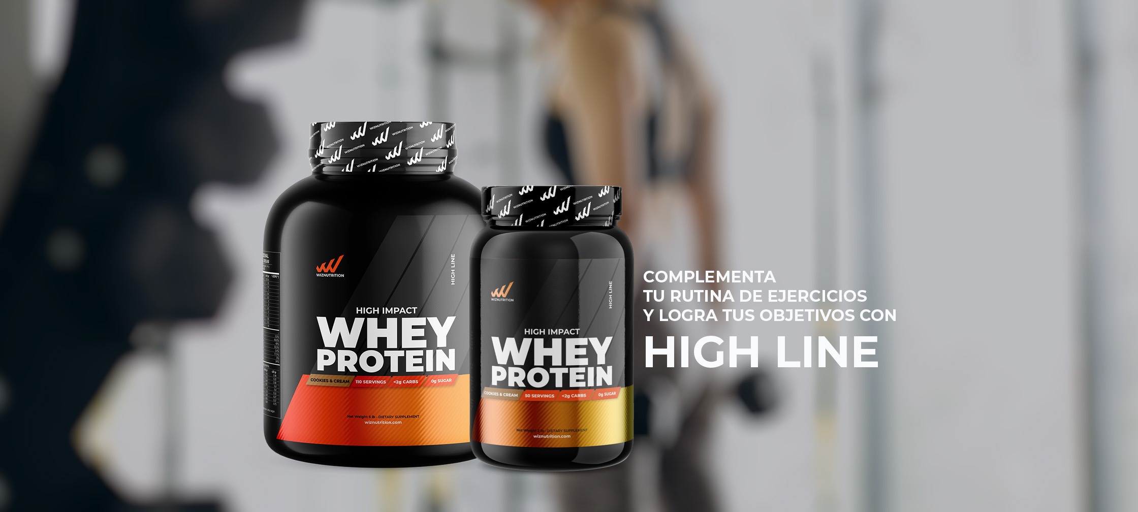
The purpose of the the promotional elements is to highlight the containers of the products and promote them at the points of sale.
