Project Brief
The core element of this branding design lies within its logo, serving as the visual embodiment of the organization, crafted from its distinct and impactful elements. From there, it extends into the proper utilization of this logo, the design of various elements, products, and the alignment of services towards a cohesive direction. Considering the club’s essence and operations, acquainting both members and staff with the aims of exclusivity and growth stands as pivotal. A shared comprehension of the brand becomes the cornerstone.
A steadfast and accurate application of the graphic identity, notably the logo, will yield heightened recognition and credibility, gradually shaping a robust brand identity in the long run. At its core, the primary goal in establishing a brand is to infuse the company with a distinctive personality, evoking a sense of belonging within the audience, thereby nurturing enduring customer loyalty.
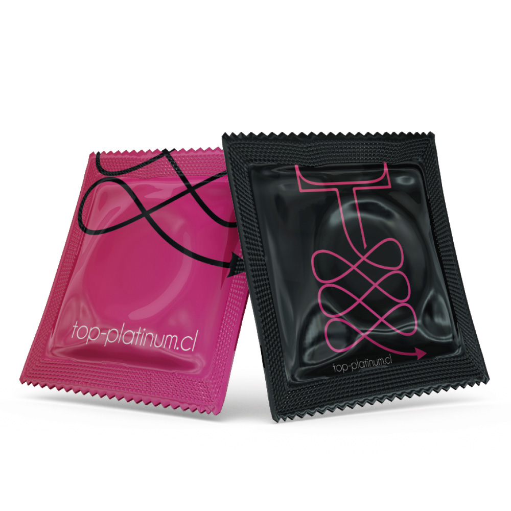
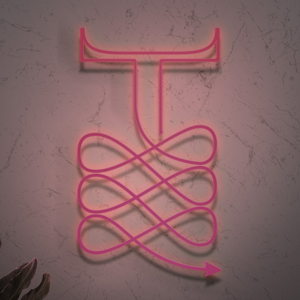
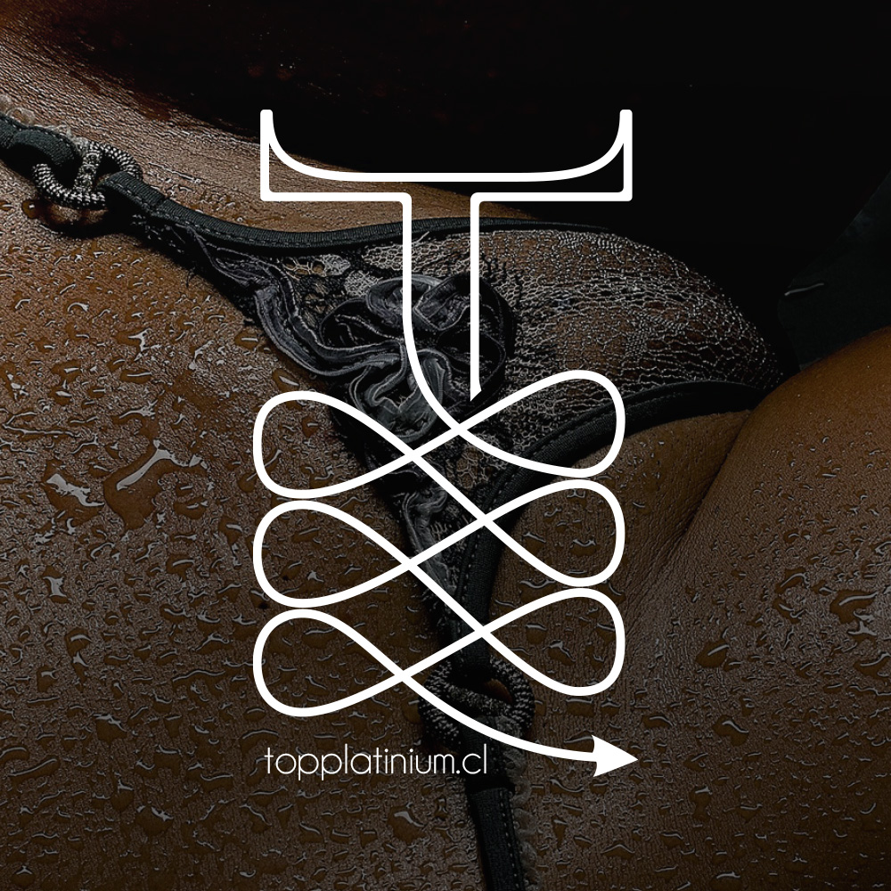
An emblematic symbol, crafted from the letter ‘T’, embodies the essence of ‘Top’. Its design draws inspiration from the inherent meaning of ‘Top’, symbolizing superiority and distinction from what lies beneath. Leveraging a serif typeface, reminiscent of prestigious champagne and sparkling wine logos, the design takes an intriguing turn by inverting serifs, forming striking horn-like elements. This subtle twist hints at the allure of the ‘sinful’ services offered.
The ‘T’ ascends gracefully, lifted by ribbons reminiscent of both elegant lingerie and the contemporary fascination with bondage. These ribbons culminate in pointed tips, resembling the devil’s tail, harmoniously echoing the horn-like motifs. A vibrant color gradient, from fuchsia to red with a predominant youthful fuchsia, infuses the design with modernity.
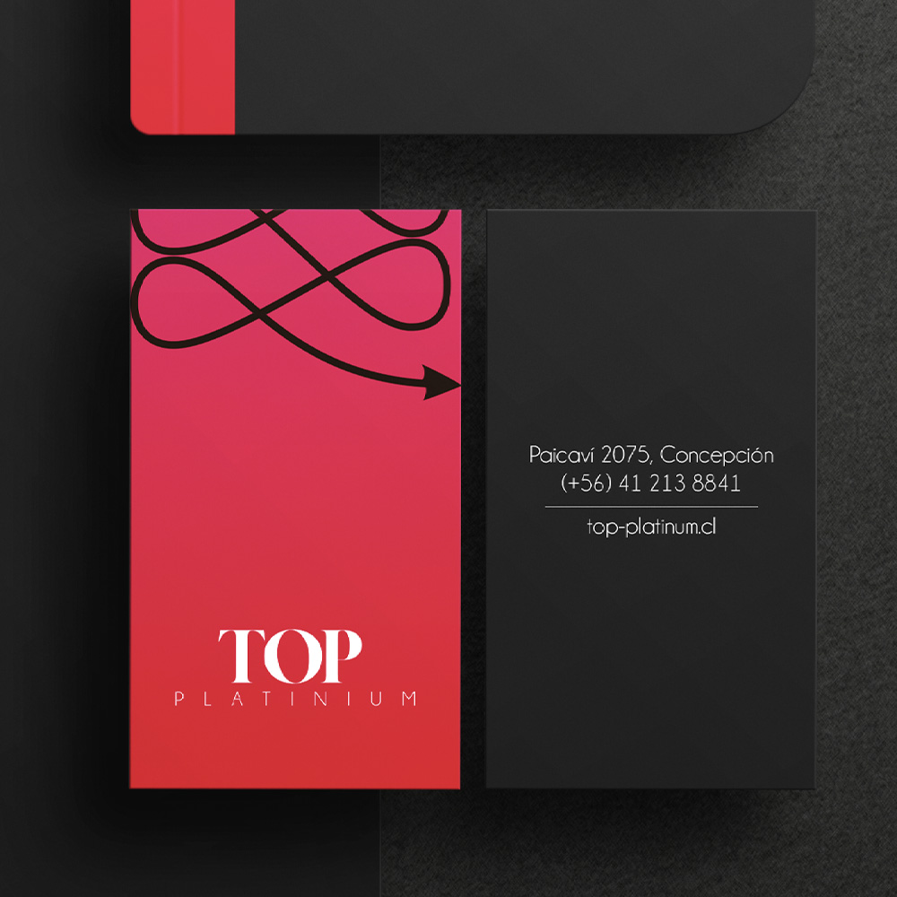
Centrally placed, the word ‘TOP’ employs a bold black serif font, serving as a visual homage to the club’s original sign.
In parallel, the logo retains key elements from the establishment’s original signage. ‘Top’ is prominently displayed, accompanied by the prestigious descriptor ‘platinum’.
The word TOP was placed in the center with a thick font to highlight the name, accompanied by the word “platinum” as its tagline.
Project Brief
The core element of this branding design lies within its logo, serving as the visual embodiment of the organization, crafted from its distinct and impactful elements. From there, it extends into the proper utilization of this logo, the design of various elements, products, and the alignment of services towards a cohesive direction. Considering the club’s essence and operations, acquainting both members and staff with the aims of exclusivity and growth stands as pivotal. A shared comprehension of the brand becomes the cornerstone.
A steadfast and accurate application of the graphic identity, notably the logo, will yield heightened recognition and credibility, gradually shaping a robust brand identity in the long run. At its core, the primary goal in establishing a brand is to infuse the company with a distinctive personality, evoking a sense of belonging within the audience, thereby nurturing enduring customer loyalty.
An emblematic symbol, crafted from the letter ‘T’, embodies the essence of ‘Top’. Its design draws inspiration from the inherent meaning of ‘Top’, symbolizing superiority and distinction from what lies beneath. Leveraging a serif typeface, reminiscent of prestigious champagne and sparkling wine logos, the design takes an intriguing turn by inverting serifs, forming striking horn-like elements. This subtle twist hints at the allure of the ‘sinful’ services offered.
The ‘T’ ascends gracefully, lifted by ribbons reminiscent of both elegant lingerie and the contemporary fascination with bondage. These ribbons culminate in pointed tips, resembling the devil’s tail, harmoniously echoing the horn-like motifs. A vibrant color gradient, from fuchsia to red with a predominant youthful fuchsia, infuses the design with modernity.
Centrally placed, the word ‘TOP’ employs a bold black serif font, serving as a visual homage to the club’s original sign.
In parallel, the logo retains key elements from the establishment’s original signage. ‘Top’ is prominently displayed, accompanied by the prestigious descriptor ‘platinum’.

The word TOP was placed in the center with a thick font to highlight the name, accompanied by the word “platinum” as its tagline.
Conceptual Design Samples
