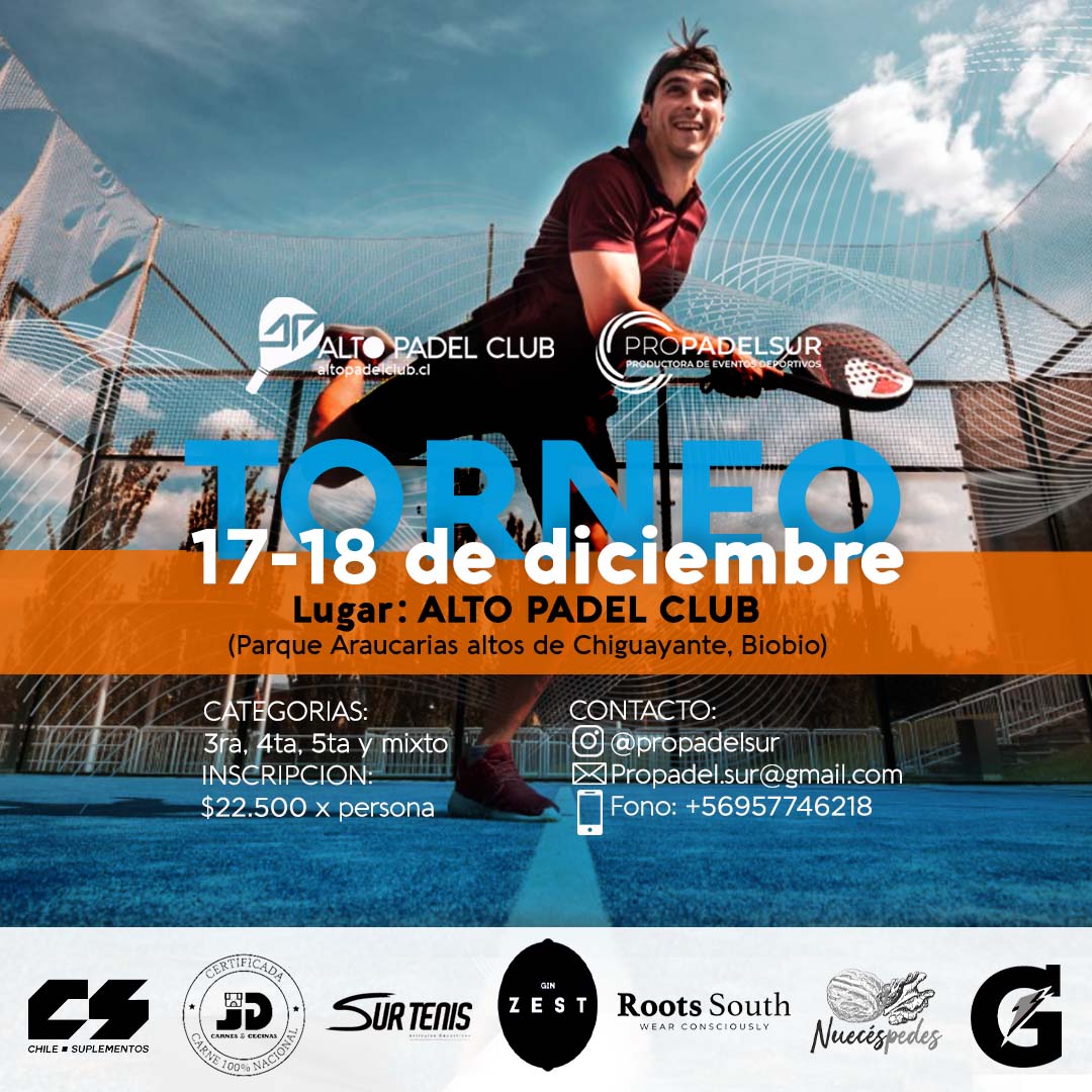
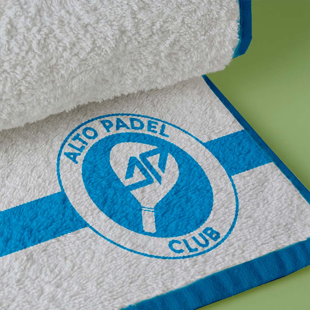
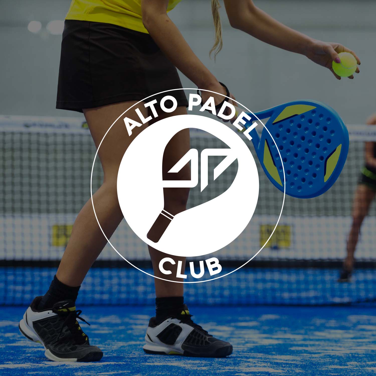
Alto Padel Club branding design embodies the spirit of athleticism and sophistication fused with a vibrant, energetic flair. We designed a logo with a dynamic fusion of sleek typography and a stylized padel racket, captures the essence of the sport’s agility and precision.
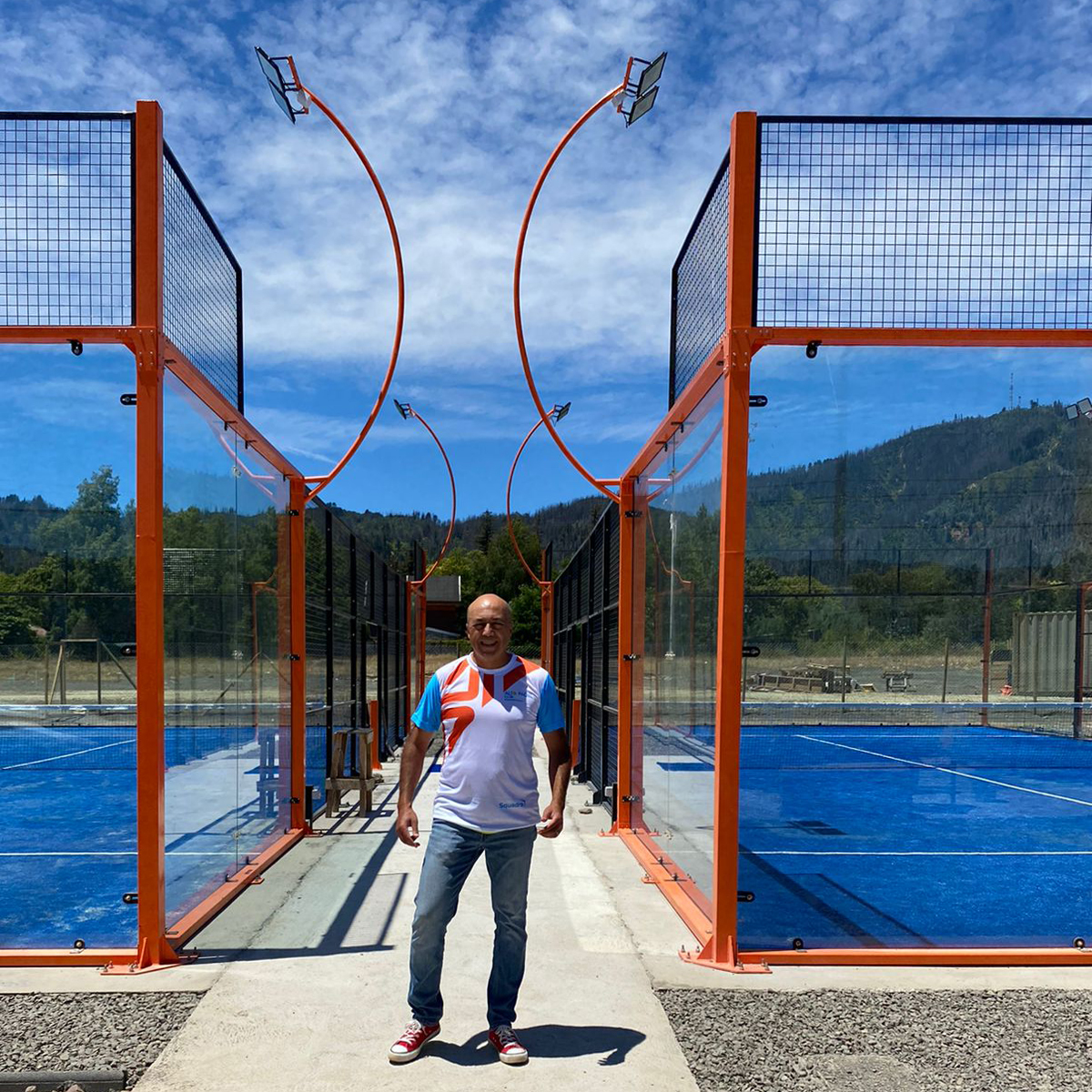
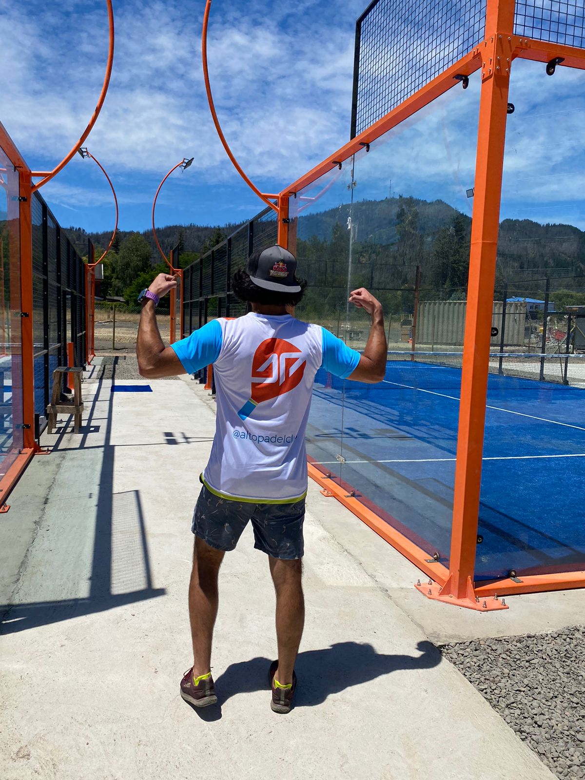
The color palette is a harmonious blend of bold, passionate hues – deep blues and fiery orange, juxtaposed with accents of vibrant green, evoking a sense of energy and excitement. These colors not only reflect the intensity of the game but also resonate with the natural surroundings, invoking a connection to the local environment.
In its visual identity, clean lines and modern design elements are prominent, reflecting the club’s commitment to professionalism and innovation. The branding materials – from signage to merchandise – exude a sense of premium quality, enhancing the overall experience for players and spectators alike.
Typography plays a vital role, combining a contemporary font for a clean, sophisticated look with playful elements that add a touch of dynamism and movement, mirroring the fast-paced nature of padel.
Alto Padel Club branding design is not just about aesthetics; it’s a representation of a lifestyle centered around passion for the sport, community engagement, and a commitment to excellence. It’s a visual testament to the club’s dedication to providing an exceptional experience for padel enthusiasts of all levels.
Conceptual Design Samples
Conceptual Design Samples
