Project Description
Project Brief
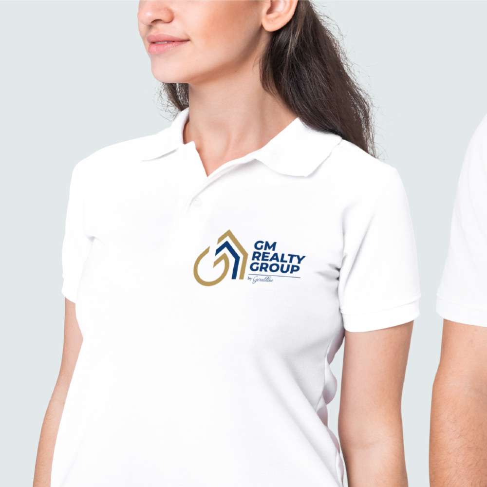
We designed an emblem that encapsulates the essence of the real estate sector in a clear and direct way. It was constructed with uniform lines and straight finishes, which provide a modern and professional appearance. The key aspect of the emblem lies in its dual reading, subtly yet clearly integrating the letters “GM,” the initials of the company, alongside the icon of a house, a universally recognized symbol in the real estate market.
In a highly competitive sector, it is crucial that the emblem communicates the nature of the business instantly. By incorporating the image of a house, we ensure that the client immediately associates the logo with real estate.
The uniform lines and straight finishes not only provide a clean, modern look but also facilitate the reproduction of the logo across various media and sizes without losing legibility or visual impact.
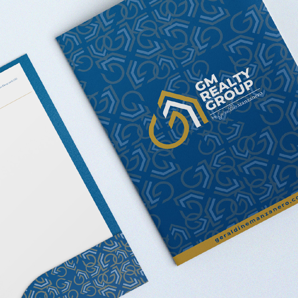
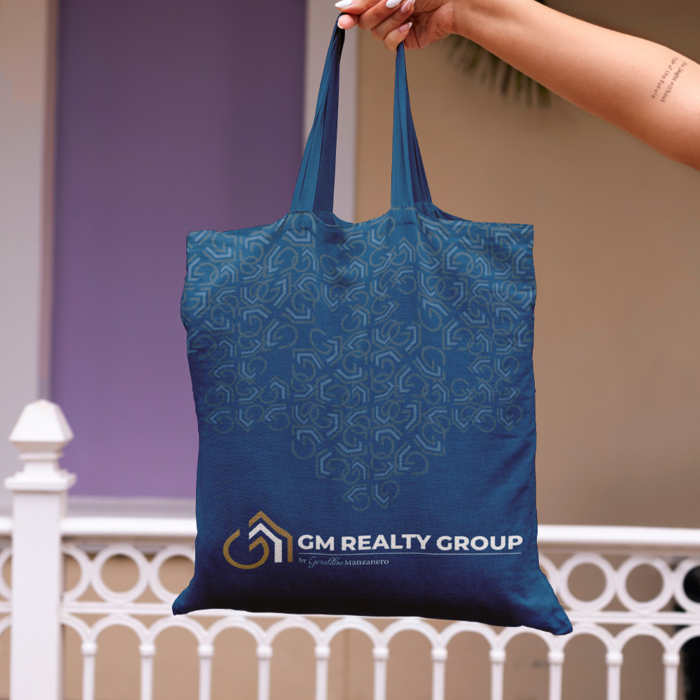
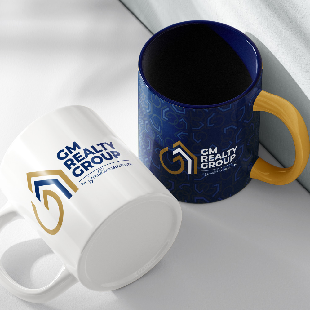
The design needed to be adaptable to different formats and platforms, from business cards and marketing materials to property signage and digital platforms.
