Project Brief
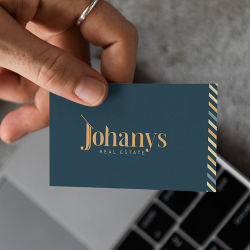
Johanys is a real estate office in the United States, with clear and distinctive characteristics. While their offerings cater to a diverse audience, special attention is given to the LUXURY HOMES label, which was a key determinant in the design. Additionally, particular shades of blue and yellow were chosen, which, although linked to the real estate sector, distinguish the brand from its competitors.
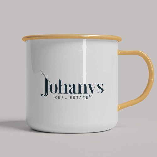
Based on this, a brand was designed within the calligraphic typology, without signs but not devoid of details in the character forms.
The Dalglish typeface was selected as the base and underwent formal modifications to create the central composition with the name Johanys. Since the name itself does not directly indicate the activity, it is ideal to accompany it with a denominator in a sans serif typeface: Corbel.

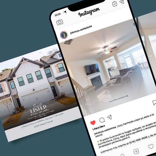
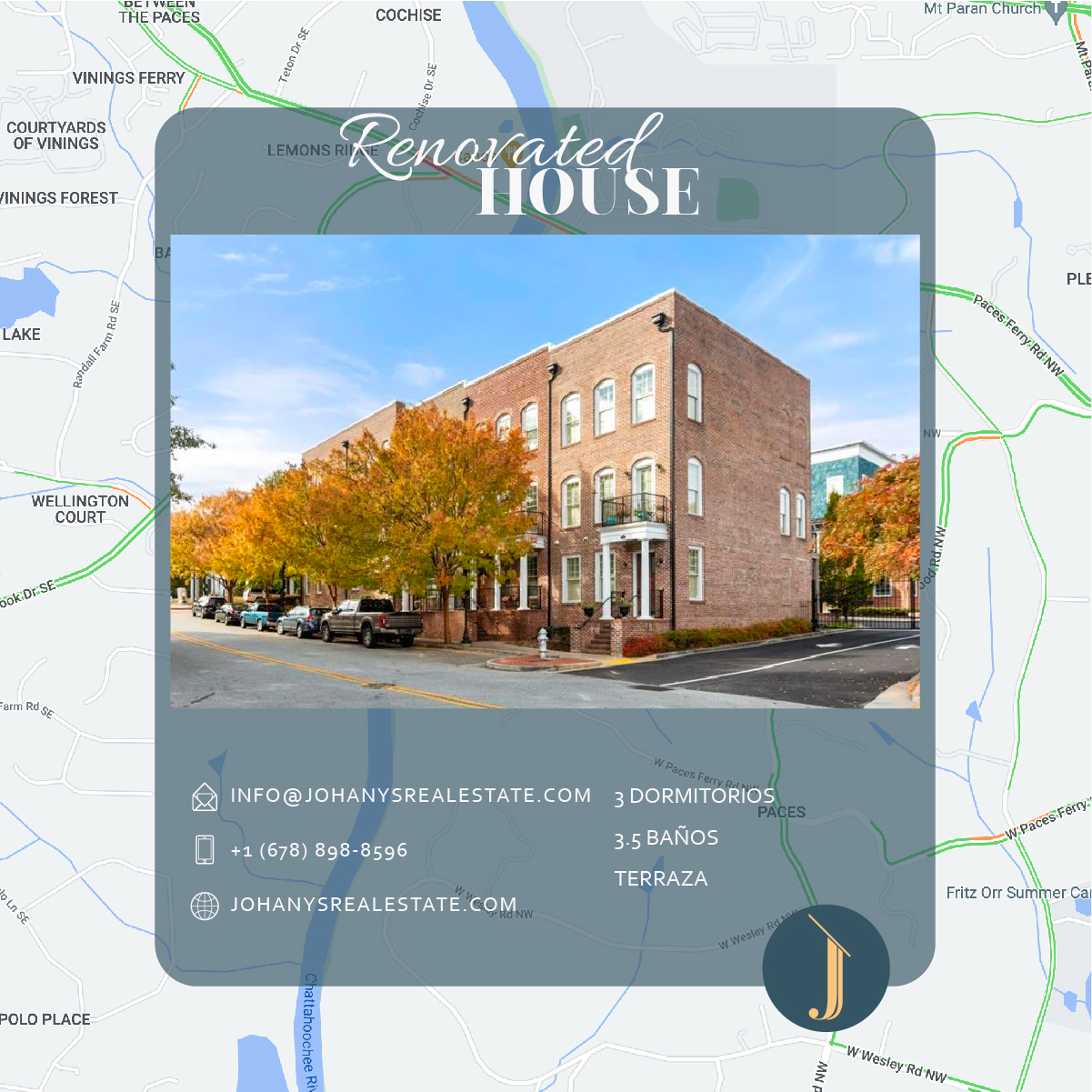
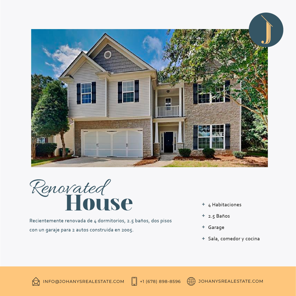
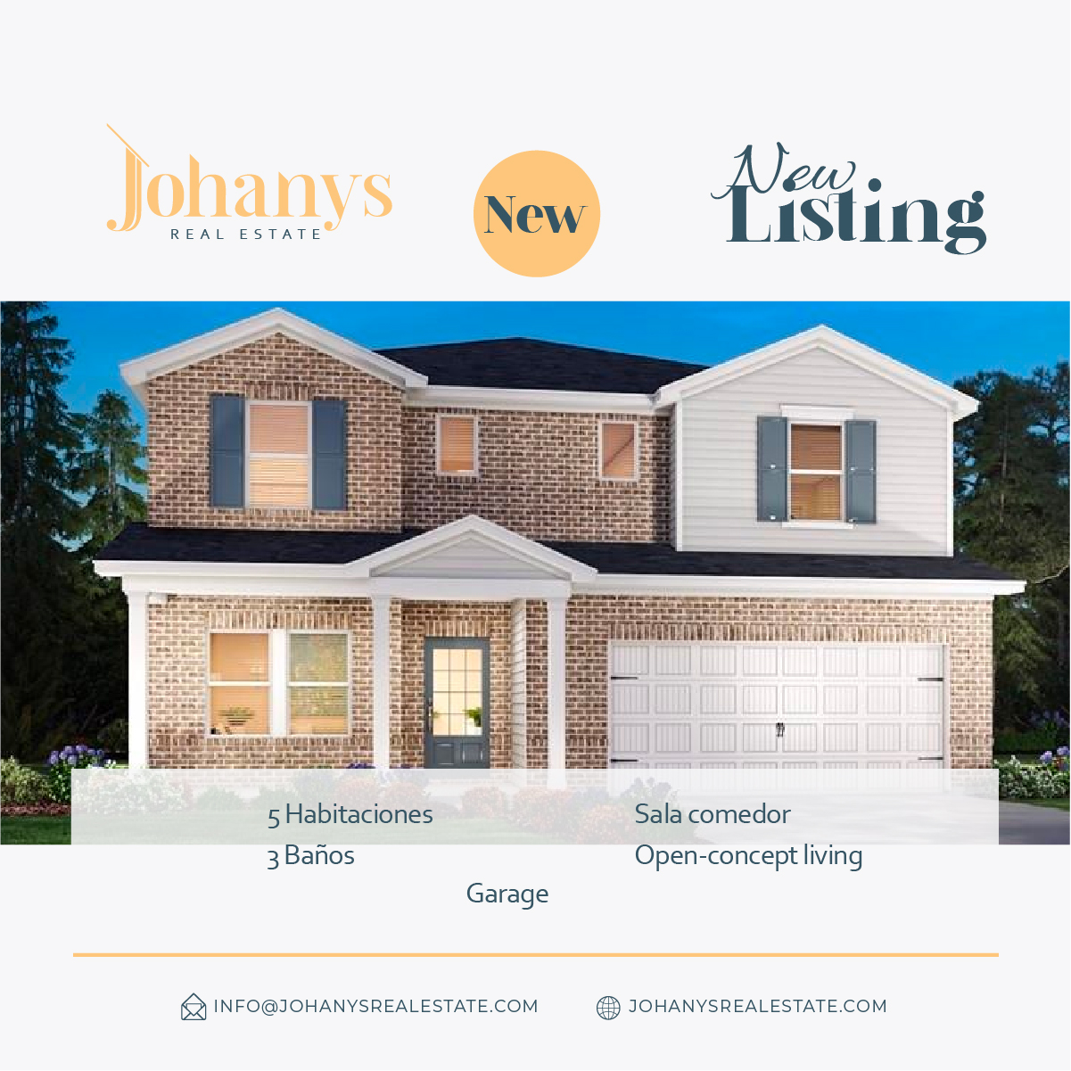
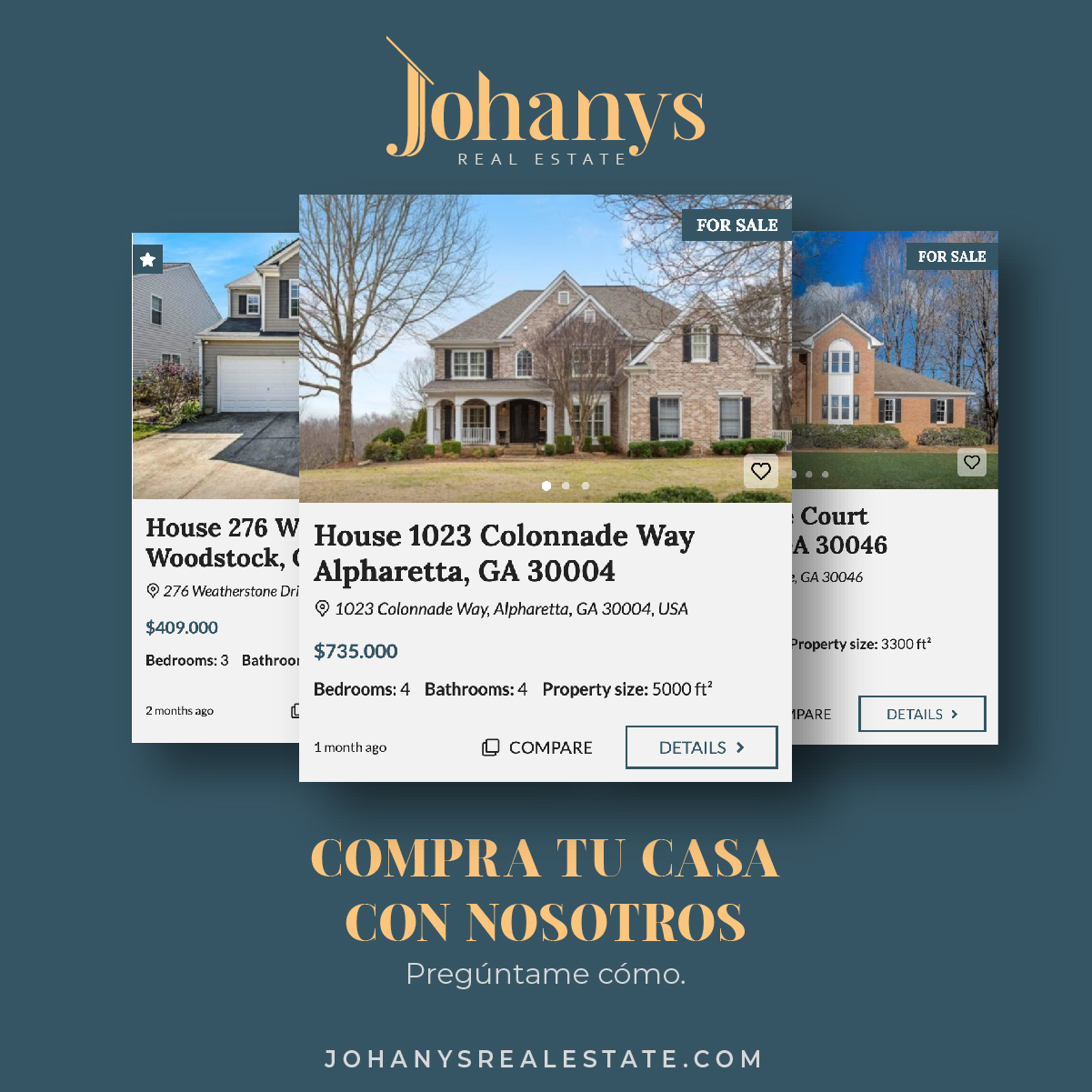
Social Media






Autor
Autor
